Section 9 Analysis
9.1 Working with survey data
We’ll use a survey data from a study of approach to engage christians in the issue of global warming. Using this data allow us to compare our results with the original. In this exercise, we’ll replicate the application of sampling weights and the standardization of variables which are common treatments of raw survey data.
## Selected variables## # A tibble: 13 x 2
## V1 V2
## <chr> <chr>
## 1 subjID "Participant ID …
## 2 GWHap "On a scale from 1 to 7, how strongly do you believe that global…
## 3 GWworry "How worried are you about global warming? …
## 4 ex_ppgender "What is your gender? …
## 5 ex_ppage "What is your age? …
## 6 raceCat "Race …
## 7 ex_ppstaten "What U.S. State do you live in? Or do you live in a U.S. Territ…
## 8 moral_pre "TOPIC 10: THE ENVIRONMENT\nIn your opinion, how much do you thi…
## 9 relig_pre "TOPIC 10: THE ENVIRONMENT\nIn your opinion, how much do you thi…
## 10 health_pre "TOPIC 10: THE ENVIRONMENT\nIn your opinion, how much do you thi…
## 11 moral_post "In your opinion, how much do you think environmental protection…
## 12 relig_post "In your opinion, how much do you think environmental protection…
## 13 health_post "In your opinion, how much do you think environmental protection…9.1.1 Variable Standardization
Standardizing variables must be performed before any regression or other statistical analysis are done with the data. It can be done by rescaling the variables using the z-score formula. Standardized variables will then have a mean of 0 and a standard deviation of 1.
# z-score formula
get.z.score <- function(X){
  (X-mean(X, na.rm=T))/sd(X, na.rm=T)
}
# standardizing the pretest and posttest variables
Zdata <- data %>% mutate(across(ends_with('_pre')|ends_with('_post'), get.z.score, .names='Z{col}'))
Zdata
## # A tibble: 1,620 x 19
## subjID GWHap GWworry ex_ppgender ex_ppage raceCat ex_ppstaten moral_pre
## <dbl> <dbl+l> <dbl+l> <dbl+lbl> <dbl> <dbl+l> <dbl+lbl> <dbl+lbl>
## 1 101 7 [I s… 6 [6] 2 [Female] 69 2 [Bla… 36 [Ohio] 4 [4]
## 2 102 4 [I a… 3 [3] 1 [Male] 30 1 [Whi… 41 [South … 4 [4]
## 3 103 6 [6] 7 [I a… 2 [Female] 31 1 [Whi… 36 [Ohio] 5 [5]
## 4 104 7 [I s… 6 [6] 2 [Female] 41 1 [Whi… 43 [Tennes… 7 [Very …
## 5 105 2 [2] 2 [2] 2 [Female] 28 1 [Whi… 14 [Illino… 4 [4]
## 6 106 5 [5] 4 [4] 2 [Female] 52 1 [Whi… 33 [New Yo… 4 [4]
## 7 107 5 [5] 6 [6] 1 [Male] 36 4 [His… 36 [Ohio] 7 [Very …
## 8 108 7 [I s… 6 [6] 2 [Female] 19 3 [Oth… 33 [New Yo… 6 [6]
## 9 109 6 [6] 5 [5] 1 [Male] 21 2 [Bla… 34 [North … 5 [5]
## 10 110 7 [I s… 5 [5] 1 [Male] 26 1 [Whi… 25 [Missis… 6 [6]
## # … with 1,610 more rows, and 11 more variables: relig_pre <dbl+lbl>,
## # health_pre <dbl+lbl>, moral_post <dbl+lbl>, relig_post <dbl+lbl>,
## # health_post <dbl+lbl>, Zmoral_pre <dbl>, Zrelig_pre <dbl>,
## # Zhealth_pre <dbl>, Zmoral_post <dbl>, Zrelig_post <dbl>, Zhealth_post <dbl>9.1.2 Sample weighting
Per Josep Espaga Reig’s book, there are 4 steps in survey weighting:
- Base/design weights: if participants have different probability of being sampled;
- Non-response weights: if some participants didn’t respond to the survey;
- Use of auxillary data/calibration: adjusting weights to the total population;
- Analysis of weight variability/trimming: to check variability in the computed weights;
In this example, we will estimate of the percent of US christian population who either believe global warming (GW) is happening or worried about GW. We will give descriptives of the distribution of these two variables and then a simple extrapolation and compute total for the whole US christian population.
Our variables of interest are:
- GWHap: On a scale from 1 to 7, how strongly do you believe that global warming is or is not happening?
- GWworry: How worried are you about global warming?
9.1.2.1 Step 1: Design weights
In the paper, it is mentionned that participants were recruited via Prime Panels. And only those who previously identified as christians were selected. It should be good to assume that each participants had an equal probability of being sampled. Therefore, we can skip the Step 1 of the weighting. If we had to compute the design weight \(d_i\), it would be equal to the inverse of the probability of being sampled: \(1/p_i\). Per Josep Espaga Reig’s book: the design weights can be interepreted as “the number of units in our population that each unit in our sample represents. […] The sum of all design weights should be equal to the total number of units in our population”.
9.1.2.2 Step 2: Non-response weights
The paper also doesn’t mention any information about non-respondent during the survey. So we can assume that there is no bias in the responses and we can skip Step 2. In short, the goal of Step 2 is to account for differences in propensity to respond among the participants. For example, participants from specific neighborhood, income level, etc may have lower response rates, and all the response we have are from a specific demographic groups, which would bias the analysis.
9.1.2.3 Step 3: Using auxillary data for weight calibration
The goal here is to calibrate the survey data to the population in general. So we would need information on both the survey respondents and the population. In this case, we will use demographic variables (gender, education, and race). One of the most common method for calibration weighting is called: raking which we will use as an the example.
We’ll use as auxiliary data the PEW Datasets which gives some statistics of the US christian population. We’ll scrape the data directly from their website so that we’ll have fewer data wrangling to do.
# PEW data
# getting only the christian respondent and their weights
pew.data <- read_sav('data/pew-data.sav') %>%
  select(RELTRAD, agerec, SEX, racethn, WEIGHT) %>%
  mutate(across(where(is.labelled), as_factor)) %>%
  mutate(across(where(is.factor), as.character)) %>%
  mutate(
    religion = RELTRAD %>% recode(
      `Evangelical Protestant Tradition`='christian',
      `Mainline Protestant Tradition`='christian',
      `Historically Black Protestant Tradition`='christian',
      `Catholic`='christian',
      `Mormon`='christian',
      `Orthodox Christian`='christian',
      `Jehovah's Witness`='christian',
      `Other Christian`='christian',
      `Jewish`='other',
      `Muslim`='other',
      `Buddhist`='other',
      `Hindu`='other',
      `Other World Religions`='other',
      `Other Faiths`='other',
      `Unaffiliated (religious "nones")`='other',
      `Don't know/refused - no information on religious identity`='other',
    ),
    pew.age = agerec %>% recode(
      `Age 24 or younger`='18-29',
      `Age 25-29`='18-29',
      `30-34`='30-49',
      `35-39`='30-49',
      `40-44`='30-49',
      `45-49`='30-49',
      `50-54`='50-64',
      `55-59`='50-64',
      `60-64`='50-64',
      `65-69`='65+',
      `70-74`='65+',
      `75-79`='65+',
      `80-84`='65+',
      `85-89`='65+',
      `Age 90 or older`='65+',
      `Don't know/refused`='NA'
    ),
    pew.race = racethn %>% recode(
      `White non-Hispanic`='White',
      `Black non-Hispanic`='Black',
      `Hispanic`='Hispanic',
      `Other`='Other',
      `Don’t know/Refused (VOL.)`='NA'
    )
  ) %>%
  filter(religion=='christian') %>%
  select(SEX, pew.age, pew.race, WEIGHT) %>%
  na.omit()

names(pew.data)[1] <- 'pew.gender'

head(pew.data,10)
## # A tibble: 10 x 4
## pew.gender pew.age pew.race WEIGHT
## <chr> <chr> <chr> <dbl>
## 1 Female 65+ White 0.438
## 2 Female 65+ White 0.384
## 3 Female 50-64 White 0.663
## 4 Female 30-49 Hispanic 1.64
## 5 Female 50-64 White 0.357
## 6 Female 65+ Black 0.664
## 7 Female 65+ White 1.42
## 8 Male 30-49 White 0.388
## 9 Male 65+ Other 0.238
## 10 Female 30-49 White 0.882pew.gender_age <- pew.data %>%
select(pew.age, pew.gender, WEIGHT) %>%
group_by(pew.gender, pew.age) %>% summarise(n=sum(WEIGHT)) %>%
tidyr::pivot_wider(names_from=pew.age, values_from=n) %>%
select(-`NA`)
pew.race <- pew.data %>% select(pew.race, WEIGHT) %>%
group_by(pew.race) %>% summarise(n=sum(WEIGHT)) %>%
filter(pew.race!='NA')Now we’ll recode our age and race variables to match the PEW data.
# interaction between gender and age
our_data.recoded <- data %>%
  select(ex_ppage, ex_ppgender, raceCat) %>%
  mutate(across(where(is.labelled), as_factor)) %>%
  mutate(
    age_group=cut(ex_ppage %>% as.numeric(), breaks=c(18, 30, 50, 65, 100), right=F)
  ) %>%
  mutate(across(where(is.factor), as.character)) %>%
  mutate(
    age_group=age_group %>% recode(
      `[18,30)`='18-29',
      `[30,50)`='30-49',
      `[50,65)`='50-64',
      `[65,100)`='65+'
    ),
    race_cat=raceCat %>% recode(
      `White Non-hispanic`='White',
      `Black Non-hispanic`='Black',
      `Hispanic`='Hispanic',
      `Other Non-hispanic`='Other',
      `Two+ races non-hispanic`='Other'
    )
  ) %>%
  tidyr::unite(col=gender_age, ex_ppgender, age_group, remove=F) %>%
  mutate(gender_age=replace(x=gender_age, list=gender_age %in% c('Female_NA', 'Male_NA'), values=NA)) %>%
  na.omit()

# number of participants/weights by units
# this would be the sum of the final weights from Step 1 and 2 if they were necessary
our_data.gender_age <- our_data.recoded %>%
  group_by(age_group, ex_ppgender) %>%
  summarise(n = n()) %>%
  tidyr::pivot_wider(names_from=age_group, values_from=n)

our_data.race <- our_data.recoded %>%
  group_by(race_cat) %>%
  summarise(n = n())

rm(list=setdiff(ls(), c('data', 'data.variables', 'Zdata', 'pew.data', 'pew.gender_age', 'pew.race', 'our_data.recoded', 'our_data.gender_age', 'our_data.race')))
Now, we’ll scale the PEW data to our sample size.
# our total (weighted) observations
our_data.wgt <- nrow(our_data.recoded)

# scaling PEW to our data
# for age and gender
pew.gender_age.scaled <- pew.gender_age %>%
  tidyr::pivot_longer(-pew.gender, names_to='pew.age', values_to='WEIGHT') %>%
  tidyr::unite(col=gender_age, pew.gender, pew.age)

total.pew <- pew.gender_age.scaled$WEIGHT %>% sum()

pew.gender_age.scaled %<>%
  mutate(Freq = round(WEIGHT/total.pew * our_data.wgt, 0) ) %>%
  select(-WEIGHT)

pew.gender_age.scaled
## # A tibble: 8 x 2
## gender_age Freq
## <chr> <dbl>
## 1 Female_18-29 149
## 2 Female_30-49 289
## 3 Female_50-64 250
## 4 Female_65+ 197
## 5 Male_18-29 131
## 6 Male_30-49 245
## 7 Male_50-64 218
## 8 Male_65+ 141# for race
pew.race.scaled <- pew.race %>%
mutate(
Freq = round(n/total.pew * our_data.wgt, 0),
race_cat=pew.race
) %>%
select(-n, -pew.race)
pew.race.scaled## # A tibble: 4 x 2
## Freq race_cat
## <dbl> <chr>
## 1 209 Black
## 2 262 Hispanic
## 3 85 Other
## 4 1071 WhiteImplementing calibration
We’ll use the same procedure explained in this book which uses the survey package.
# No weights or probabilities supplied, assuming equal probability
our.svydesign <- svydesign(ids = ~ 0, data=our_data.recoded)

# the variable used for calibration are: gender/age interaction and race
our.raked <- rake(our.svydesign, sample.margins = list(~race_cat, ~gender_age), population = list(pew.race.scaled, pew.gender_age.scaled))

# collecting the weights
raked.weight <- our.raked$postStrata[[1]][[1]] %>% attributes() %>% .[["weights"]]
weighted_data <- our_data.recoded
weighted_data$raked.weight <- raked.weight

head(weighted_data, 10)
## # A tibble: 10 x 7
## ex_ppage gender_age ex_ppgender raceCat age_group race_cat raked.weight
## <dbl> <chr> <chr> <chr> <chr> <chr> <dbl>
## 1 69 Female_65+ Female Black Non-h… 65+ Black 2.11
## 2 30 Male_30-49 Male White Non-h… 30-49 White 0.959
## 3 31 Female_30-… Female White Non-h… 30-49 White 0.688
## 4 41 Female_30-… Female White Non-h… 30-49 White 0.688
## 5 28 Female_18-… Female White Non-h… 18-29 White 0.361
## 6 52 Female_50-… Female White Non-h… 50-64 White 0.875
## 7 36 Male_30-49 Male Hispanic 30-49 Hispanic 2.41
## 8 19 Female_18-… Female Other Non-h… 18-29 Other 0.531
## 9 21 Male_18-29 Male Black Non-h… 18-29 Black 1.29
## 10 26 Male_18-29 Male White Non-h… 18-29 White 0.9459.2 Working with COVID-19 data
In this example, we’ll use daily updated data from the JHU Covid Resource Center to create animated time series of coronavirus cases and deaths in the US.
The data is available in their GitHub. We’ll use the daily report for the US from 04-12-2020 to 06-22-2020.
repo.url <- 'https://raw.githubusercontent.com/CSSEGISandData/COVID-19/master/csse_covid_19_data/csse_covid_19_daily_reports_us/'

# importing all csv
us.covid.files <- list()
date.format <- '%m-%d-%Y'
dates <- format(seq(as.Date('2020/04/12'), as.Date(as.Date('2020/06/22')), by='day'), date.format)
i <- 1
for (date in dates){
  us.covid.files[[i]] <- read.csv(url(paste0(repo.url, date, '.csv'))) %>%
    select(Province_State, Confirmed, Deaths, Recovered, Mortality_Rate) %>%
    mutate(Date=as.Date(date, date.format), Confirmed.rank=rank(-Confirmed),
           Deaths.rank=rank(-Deaths), Mortality.rank=rank(-Mortality_Rate))
  i <- i+1
}
# preview of the 1st df
head(us.covid.files[[1]])
## Province_State Confirmed Deaths Recovered Mortality_Rate Date
## 1 Alabama 3563 93 NA 2.610160 2020-04-12
## 2 Alaska 272 8 66 2.941176 2020-04-12
## 3 Arizona 3542 115 NA 3.246753 2020-04-12
## 4 Arkansas 1280 27 367 2.109375 2020-04-12
## 5 California 22795 640 NA 2.812020 2020-04-12
## 6 Colorado 7307 289 NA 3.955112 2020-04-12
## Confirmed.rank Deaths.rank Mortality.rank
## 1 22 27 33
## 2 51 47 27
## 3 23 21 24
## 4 39 39 43
## 5 6 7 29
## 6 16 14 14# line series by state
last.df <- us.covid.files[[length(us.covid.files)]]
# creating plot object
us.covid.plot <- ggplot(us.covid.df %>% filter(Confirmed.rank <=10),
aes(y=Confirmed.rank, group=Province_State, fill=Province_State)) +
geom_tile(aes(x=Confirmed/2, width=Confirmed, height=0.9), alpha=0.8, color=NA) +
geom_text(aes(x=0, label=paste(Province_State, ' ')), hjust=1, vjust=1) +
geom_text(aes(x=Confirmed, label=paste0(' ', round(Confirmed/1000), 'k')), hjust=0) +
scale_y_reverse() + coord_cartesian(clip='off') +
theme_bw() +
# custom ggtheme
theme(legend.position='none', axis.line=element_blank(),
axis.title=element_blank(), axis.ticks=element_blank(),
axis.text=element_blank(), panel.grid.major.y=element_blank(),
panel.grid.minor.y=element_blank(), panel.border=element_blank(),
plot.margin = margin(2,1,2,3,'cm'))
# creating animation object
us.covid.anim <- us.covid.plot + transition_states(Date, transition_length=4, state_length=1) +
view_follow(fixed_x=T) +
labs(title = 'Daily coronavirus cases : {closest_state}',
subtitle = 'Top 10 States',
caption ='Data Source: Johns Hopkins Coronavirus Resource Center')
# creating gif file of the animation object
animate(us.covid.anim, nframes=400, fps=10, renderer=gifski_renderer('images/us-covid-rank.gif'))us-covid-rank
The previous animated plot shows the the evolution of the number of cases. And changing to other variables such as Mortality_Rate or Deaths would follow the same steps.
Now, if instead we want to show how the evolution of case change over space, we can do mapping instead. here is an example for the mortality rate variable.
library(sf)
# first we'll join with a geometry feature of the US
us.states.geo <- read_sf('data/us-states/us-states.shp')
# adding geometry
us.covid.sf <- us.states.geo %>% right_join(us.covid.df, by=c('state_name'='Province_State'))
# mapping
break_val <- c(2.5,5,7.5)
map <- ggplot(us.covid.sf) +
geom_sf(aes(fill=Mortality_Rate), size=.1) +
scale_fill_steps2(breaks=break_val, labels=break_val, midpoint=5, high='#F44336', low='#28B463', limits=c(0,10)) +
coord_sf(crs=5070) + theme_bw() +
# custom ggtheme
theme(legend.position='bottom', axis.line=element_blank(),
axis.title=element_blank(), axis.ticks=element_blank(),
axis.text=element_blank(), panel.grid.major.y=element_blank(),
panel.grid.minor.y=element_blank(), panel.border=element_blank(),
plot.margin = margin(1,1,1,1,'cm'))
map.anim <- map +
transition_manual(frames=Date) +
labs(title = 'Daily coronavirus cases : {current_frame}',
caption ='Data Source: Johns Hopkins Coronavirus Resource Center')
animate(map.anim, nframes=300, fps=10, renderer=gifski_renderer('images/us-covid-map.gif'))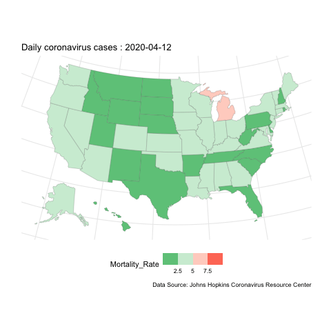
us-covid-map