Section 7 Visualization
7.1 Simple graphs with ggplot2
GGPlot2 is one of the most universally applicable visualization packages currently available for R-Studio. It provides a set of tools that make it incredibly dynamic and versatile. As such, we will provide an introductory examination of some of the best features that you can integrate into your analysis.
Data visualization is about telling the story of the data in a digestible way and highlighting key traits that would not otherwise be apparent. Whether you are using plots for personal exploratory analysis or in a final presentation of your findings, they can transform a sheet of numbers into a decipherable and palatable image.
# Read in the necessary packages for our work
library(haven)
library(ggplot2)
library(tidyr)
library(dplyr)

# Read in the sav file, and filter it
raw.data <- read_sav('data/ypccc-hurricane.sav')
raw.data <- raw.data %>% filter(raw.data$Q1==1 || raw.data$Q2==1)
raw.data <- raw.data %>% filter(!is.na(raw.data$Q3), raw.data$Q3!=2, raw.data$Q3!=3)

# Recode number codes into text labels
raw.data$S5_cluster <- recode(as.character(raw.data$S5_cluster), '1'='DieHards', '2'='Reluctant', '4'='Optimists', '3'='Constrained', '5'='First Out')

# Save S5_cluster as a factor
raw.data$S5_cluster <- factor(raw.data$S5_cluster, ordered=T, levels=c('First Out', 'Constrained', 'Optimists', 'Reluctant', 'DieHards'))

# Keep only the non-missing data
data <- raw.data[!is.na(raw.data$S5_cluster),]
The raw data that we will be using for this section covers Hurricanes and their attached attributes.
7.1.1 Setting ggplot2 theme
The ‘theme’ of ggplot2 is the aesthetic with which it produces every default plot or figure. By setting the theme, you are able to customize size, color palette, positioning of labels, font, text characteristics, and a whole series of other qualities which are well documented online. Below, we save a standard theme as ‘plot_theme’ so that we can use it later. Within the description, we clarify margins, text size, key size, and element sizes.
To set color, we use HTML color codes, a standard across many coding languages. Color can be described by a six character string, consisting of numbers and characters in hexadecimal form. You can go to this website to access a color palette selector if there is a particular shade you want. You then pass this code as "# + xxxxxx" to the color argument.
# Save the plot theme
plot_theme <-
  theme(
    # Describe margins and sizes
    legend.title = element_blank(),
    legend.box.background = element_rect(),
    legend.box.margin = margin(6, 6, 6, 6),
    legend.background = element_blank(),
    legend.text = element_text(size=12),
    legend.key.size = unit(1, "cm")
  ) +
  theme(
    # Describe production and color of the axes
    axis.text = element_text(size=12, face='bold'),
    axis.line = element_line(size = 1, colour = "#212F3D"),
    axis.title.x = element_blank(),
    axis.title.y = element_blank()
  ) +
  theme(
    # Describe the title and background
    plot.title = element_text(size = 20, face='bold', hjust = 0.5, margin=margin(6,6,6,6)),
    plot.background=element_blank()
  ) +
  theme(
    # Describe the grid lines
    panel.grid.major.x = element_blank(),
    panel.grid.minor.x = element_blank(),
    panel.grid.major.y = element_line(size=1)
  )

# To see all information about your current theme, you can use theme_get()
description <- theme_get()
7.1.2 ggplot2 Example 1: Stacked bar plot
The first example we will provide is that of a stacked bar plot, which shows the statistics of distribution across categorical levels within a separate categorical level. For our example, we will show the percentage of Connecticut residents who understand that their home is in an evacuation zone, split across First Out, Constrained, Optimists, Reluctant, or DieHards. Plots like this one are good for getting a sense of how two categorical variables are related, much as you might observe in a two-way table or statistically evaluate with a Chi-square Test for Homogeneity.
Take a look at the code below for an example of a call to ggplot. First, we make sure that our data is saved as categorical variables, and that it is sorted and filtered appropriately. Next, we call ggplot() and pass it the dataframe we want to use, which in this case is Q31_Data, a new frame that has the points stored as percentages for each part of the stacked bars. The second argument we pass is aes(), which we can fill with details clarifying the aesthetic we want to use. The x= is the data on the x-axis the y= is the data on the y-axis. The fill is what distinguishes each segment of the stacked bar.
Once we have told ggplot() what data it will be using, we put + and clarify the type of plot we want to construct, in this case geom_bar(). Every time we write +, it means that we are making a further adjustment to the existing plot under construction. We give arguments clarifying the aesthetics further, then stick on geom_text() to describe what labels to use, how to render them, and where to put them on the plot. To set the colors manually, we call scale_fill_manual() and pass the color codes we want used. Calling scale_y_continuous() lets us make the y-axis operate on a 0-100% scale. Using labs() lets us put the label text in manually, and theme() lets us clarify where we want that main title. The results can be seen below.
# Q31. Is your home located in a hurricane evacuation zone, or not?
data$Q31 <- as_factor(data$Q31)
data$Q31 <- factor(data$Q31, ordered=T, levels=c('No', 'Not Sure', 'Yes'))

# Create the dataframe of just the relevant columns, summarized into sums and taken as a percentage
Q31_data <- data %>%
  select(Q31, S5_cluster, Final_wgt_pop) %>%
  # na.omit() %>%
  group_by(S5_cluster, Q31) %>%
  summarise(Q31.wgt = sum(Final_wgt_pop)) %>%
  mutate(freq.wgt = round(100*Q31.wgt/sum(Q31.wgt))) %>%
  filter(!is.na(Q31))

# Produce the plot, using the ggplot call
ggplot(Q31_data, aes(x=S5_cluster, y=freq.wgt, fill=Q31)) +
  geom_bar(aes(fill=Q31), width=.7, stat='identity') +
  geom_text(aes(label=freq.wgt, vjust=.5), position = position_stack(vjust = 0.5), colour='white', size=6, fontface='bold') +
  scale_fill_manual(values=c('#DC7633', '#5D6D7E', '#5499C7'), breaks=c('Yes', 'Not Sure', 'No')) +
  scale_y_continuous(labels = function(x) paste0(x, "%"), expand = c(0, 0), limits = c(0, 100)) +
  labs(title = "% of CT coastal residents who understand\nthat their home is in an evacuation zone") +
  theme(legend.position="top") +
  plot_theme + theme(legend.box.background = element_blank(), legend.spacing.x = unit(.2, 'cm'))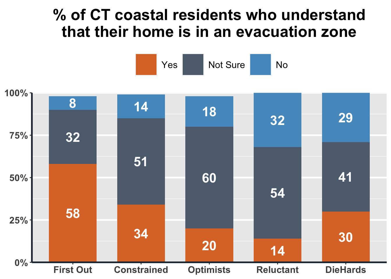
While it may seem overwhelming at first to use ggplot2, keep in mind that you can supply as much or as little detail and customization to your plot as you want. What we have done in this document is generate finely tuned plots to highlight a wide variety of customizable tools, but if your goal is to simply put the numbers in a plot, that can be done quite intuitively.
7.1.3 ggplot2 Example 2: Grouped bar plot
If, instead of a stacked bar plot, you want to group the bars next to each other in sequence to get a sense not only of percentage but also total count, you can use a grouped bar plot as we have done below. For this example, we use the perception of people within each segment about how likely they think it is that a Category 1, 2, 3, or 4 hurricane will hit somewhere along the Connecticut coast in the next 50 years.
# Q23. On a scale of 0%-100%, with 0% being it definitely will NOT happen and 100% being it definitely WILL happen,
# how likely do you think it is that each of the following types of hurricane will hit somewhere along the
# Connecticut coast in the next 50 years?
Q23_data <- data %>%
  select(S5_cluster, Q23_1, Q23_2, Q23_3, Q23_4, Final_wgt_pop) %>%
  pivot_longer(-one_of('S5_cluster', 'Final_wgt_pop'), names_to="Category", names_prefix = "Q23_", values_to = "Q23") %>%
  mutate(Category = paste("Category", Category), Q23.wgt = Q23 * Final_wgt_pop) %>%
  na.omit() %>%
  group_by(S5_cluster, Category) %>%
  summarise(freq.wgt = round(sum(Q23.wgt, na.rm=T)/sum(Final_wgt_pop, na.rm=T)))

# Produce the plot
ggplot(Q23_data, aes(x=S5_cluster, y=freq.wgt, fill=Category)) +
  geom_bar(aes(fill=Category), width=.7, position=position_dodge(.8), stat='identity') +
  geom_text(aes(label=freq.wgt, vjust=1.2), position=position_dodge(.8), colour='white', size=6, fontface='bold') +
  scale_fill_manual(values=c('#F6DDCC', '#EDBB99', '#E59866', '#DC7633')) +
  scale_y_continuous(labels = function(x) paste0(x, "%"), expand = c(0, 0), limits = c(0, 100)) +
  labs(title = "Average perception of each segment that\na Category 1, 2, 3, or 4 hurricane will occur\nin the next 50 years") +
  theme(legend.position="top") +
  plot_theme +
  theme(legend.box.background = element_blank(), legend.spacing.x = unit(.2, 'cm'))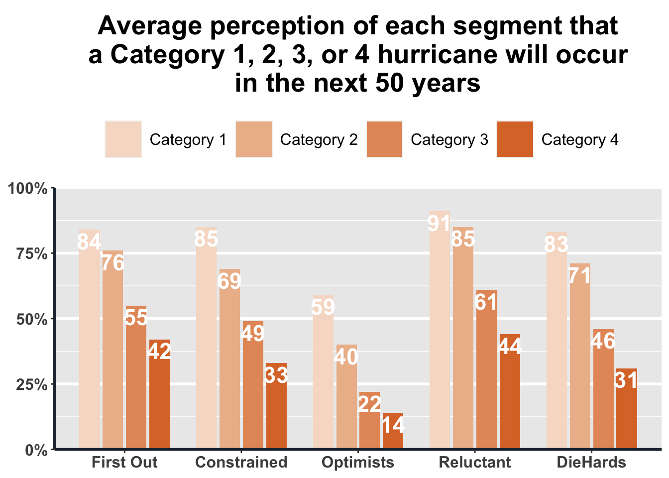
7.1.4 ggplot2 Example 3: Scatterplot
The plots below are examples of how to make a more complicated scatterplot. The data in the first plot describe state-level average annual temperature anomalies by average annual precipitation. In addition to the simple two-way scatterplot, we can also color the points by a third categorical variable, in this case the period of time in which the data were recorded. All labels can be customized as we do below, and we’ve added error bars to show uncertainty in a shaded gray region around the data.
We’ve commented out a line of code that can be used to save your plot as a .png file, which is the default image file type in R. You can customize the saved file’s name, height, and width within a call like this. Whenever we ask R to save a dataset, a file, a plot, or an image, it will assume that we want it in our current Working Directory. If, instead, you want to store the output somewhere else, you can clarify the path when you write out the name.
The second, simpler plot that we generated below displays California temperature anomalies by year. We are going to put a legend onto this plot with scale_color_gradient(), which is particularly helpful if the goal is to highlight a trend over the spread of the time series.
# Scatterplot of state-level average annual temperature by avg annual precipitation (values and anomalies)
# Data source: https://www.ncdc.noaa.gov/cag/statewide/time-series
# Need to set base period from 1978 to 1998 in Options dialog and set parameters before downloading (12-Month)
ca.pcp <- read.csv('data/4-pcp-12-12-1978-2020.csv', skip=4)
ca.tavg <- read.csv('data/4-tavg-12-12-1978-2020.csv', skip=4)

# Reassign the column names
names(ca.pcp) <- c('Year', 'Precip', 'Precip.Anomaly')
names(ca.tavg) <- c('Year', 'Temp', 'Temp.Anomaly')

# Perform a left join and filter the data
ca.weather <- left_join(ca.tavg, ca.pcp, by='Year') %>%
  mutate(Year=as.integer(substr(Year, 1, 4)),
         Period=if_else(Year<1990, 'Before 1990',
                         if_else(Year<2000, '1990-2000',
                                 if_else(Year<2010, '2000-2010', 'Since 2010')))) %>%
  mutate(Period=factor(Period, c('Before 1990', '1990-2000', '2000-2010', 'Since 2010')))

# Produce the base ggplot
s <- ggplot(data = ca.weather, aes(x=Temp.Anomaly, y=Precip.Anomaly))
hottest.v <- max(ca.weather$Temp.Anomaly)
hottest.y <- filter(ca.weather, Temp.Anomaly==hottest.v)$Year
driest.v <- min(ca.weather$Precip.Anomaly)
driest.y <- filter(ca.weather, Precip.Anomaly==driest.v)$Year

# Print the plot with all of the adjustments
s +
  geom_point(aes(color=Period), size=2) +
  geom_smooth() +
  geom_label(label=if_else(ca.weather$Temp.Anomaly==hottest.v, paste('Hottest Year\n', hottest.y), NULL), nudge_x = -.2, nudge_y = 2.5, fill='transparent', label.size = NA) +
  geom_label(label=if_else(ca.weather$Precip.Anomaly==driest.v, paste('Driest Year\n', driest.y), NULL), nudge_x = 0, nudge_y = 0, fill='transparent', label.size = NA) +
  labs(title='Hotter and Drier Wildfire Seasons in California', subtitle='Precipitation vs. temperature anomalies in California from January to October over 40 years (1978-2020)', caption='Data from NOAA', y='Precipitation anomaly (inches)', x='Temperature anomaly (°F)') +
theme_light() 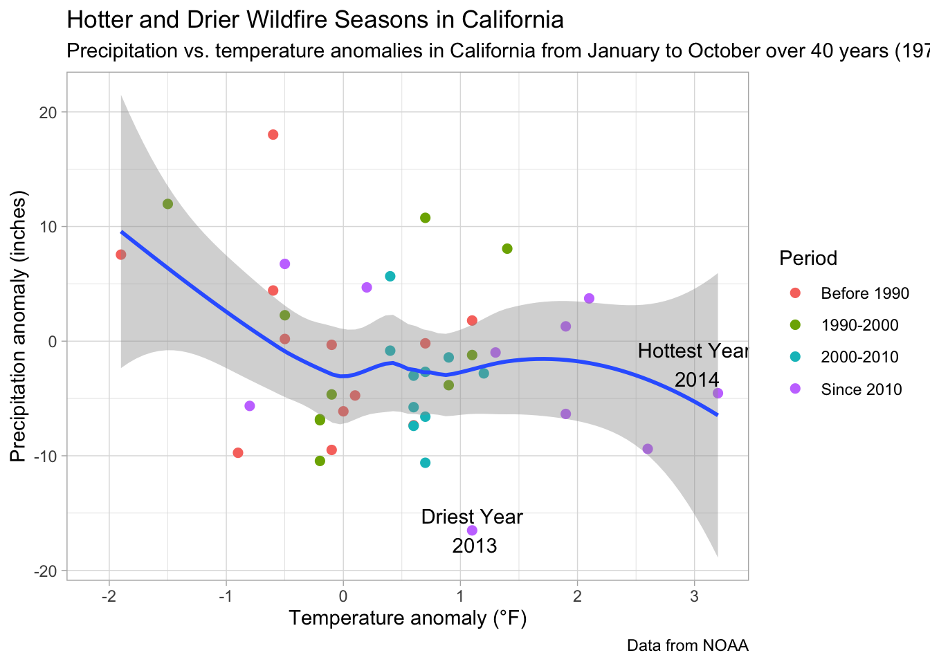
# Save as png file
# ggsave(file = 'CA.weather.png', height=9, width=12)

# Produce our second, simpler scatterplot
ggplot(ca.weather, aes(Year, Temp.Anomaly)) +
  geom_line(color='#0D47A1') + geom_point(aes(color=Temp.Anomaly)) +
  geom_hline(yintercept=0, linetype=2, color='#aaaaaa') +
  labs(title='California Temperature Anomaly 1978-2020') +
  scale_color_gradient(low='blue', high='red') +
  theme_classic()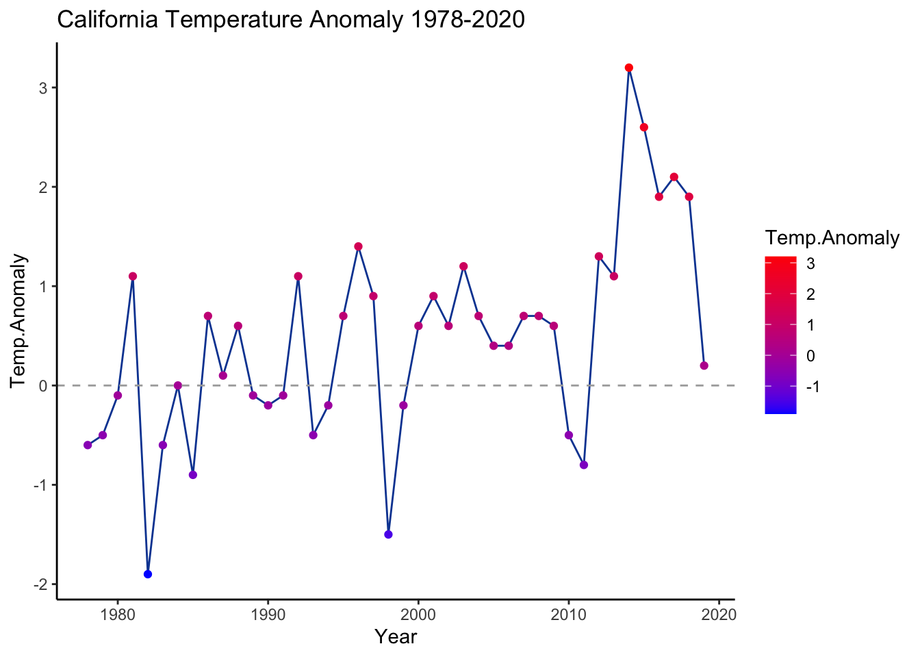
7.2 Animated graph with gganimate
To make a plot dynamically animated for insertion into a webpage, presentation, or any platform that supports gif images, we can simply add gganimate to the plot’s code. After choosing the aesthetic elements of the plot, write the transition_reveal() code, and clarify the sequence along which points should emerge, to get the result that we see below.
library(gganimate)
animated.plot <- ggplot(ca.weather, aes(Year, Temp.Anomaly)) +
  geom_line(color='#0D47A1') +geom_point(aes(color=Temp.Anomaly)) +
  geom_hline(yintercept=0, linetype=2, color='#aaaaaa') +
  labs(title='California Temperature Anomaly 1978-2020') +
  scale_color_gradient(low='blue', high='red') +
  theme_classic() +
  # labels
  geom_label(aes(label=as.character(Year)), nudge_y=.3) +
  # gganimate code
  transition_reveal(seq_along(Year))
# animate(animated.plot)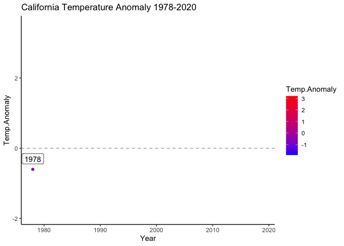
gganim
7.3 Interactive graph with plotly
Creating an interactive version of the previous graphs is pretty simple using plotly. You just have to separate the data by group, which we do in the plot below through a series of filter commands from tidyverse. The benefit to creating an interactive graph is that the user can explore specific data, compare data by hovering over boxes, or move about the plot itself. This level of interactivity makes their reception of the data more nuanced, and may answer questions that a static plot would not.
7.3.1 plotly Example 1: Interactive version of the stacked bar
library(plotly)

# Split and filter the data
Q31.yes <- Q31_data %>%
  filter(Q31=='Yes')
Q31.notsure <- Q31_data %>%
  filter(Q31=='Not Sure')
Q31.no <- Q31_data %>%
  filter(Q31=='No')

# Produce the plotly object
plot_ly(x=Q31.yes$S5_cluster, y=Q31.yes$freq.wgt, type='bar', name='Yes', marker = list(color = '#DC7633'), text = Q31.yes$freq.wgt, textposition = 'auto') %>%
  add_trace(x=Q31.notsure$S5_cluster, y=Q31.notsure$freq.wgt, name='Not Sure', marker = list(color = '#5D6D7E')) %>%
  add_trace(x=Q31.no$S5_cluster, y=Q31.no$freq.wgt, name='No', marker = list(color = '#5499C7')) %>%
  layout(barmode = 'stack')
You can find more examples of using plotly on their website.
7.4 Web app with RShiny
This Shiny tutorial was edited based on the official tutorial on the website
With RShiny, it is possible to make functions in your R script available to people who do not necessarily know R. For example, in this app, you can create different types of graphs by selecting site, plot type, and other parameters. It uses the power of R libraries to create interactive plots for exploration.
Just like any other web tool, an RshinyApp has components on the User and Server side.
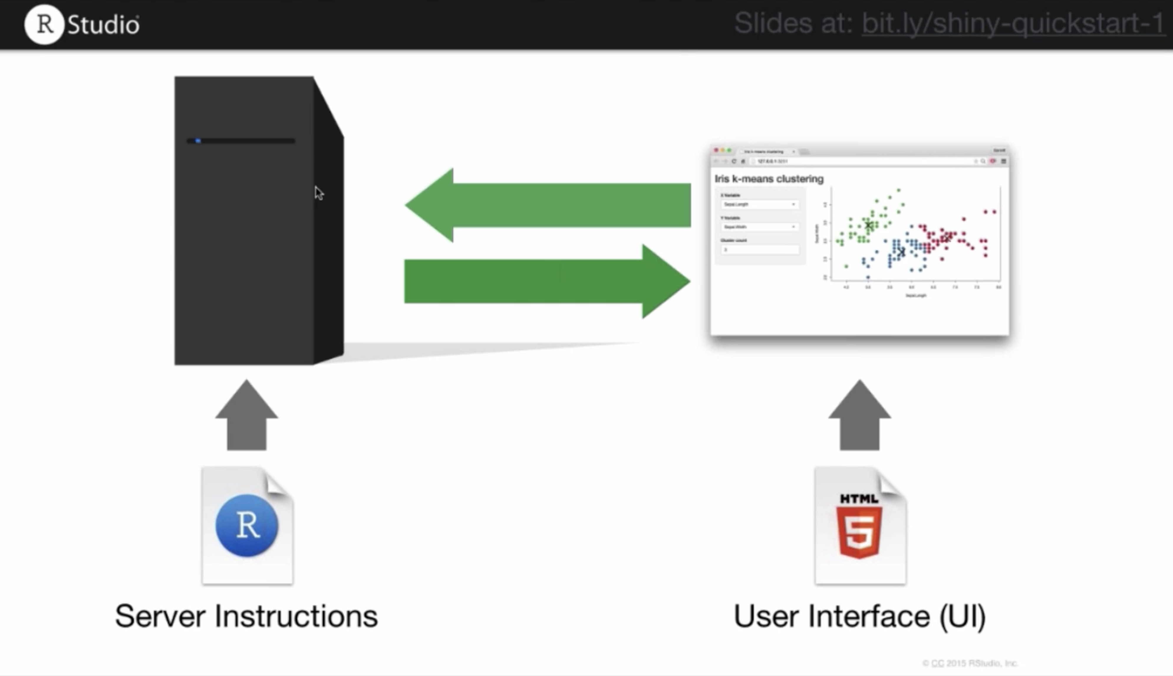
The visual appearance of the app can be modified in the user component. You can change layout, font size, color, etc. On the server side, you can customize how your app responds to user inputs or interactions, what options to make available, and what the default presentation is. If you are running this code simultaneously in your own RStudio window, the code below will generate a new panel in which the ShinyApp object lives. Because we have not built it out yet, you will see an empty window if you run the code below:
A basic ShinyApp starter template looks like this:
Some content will show up when you add some (text) elements with fluidPage, as we do below.
7.4.1 Input functions
For richer content, the shiny package has built-in functions that allow you to insert various applications, information, and interactive elements. We will demonstrate one of them, sliderInput, which adds a slider into your web app.
# Generate a user slider from 1 to 100
ui <- fluidPage(
  sliderInput(inputId='num',
              label='Choose a number',
              value=25, min=1, max=100)
)
server <- function(input, output){}
shinyApp(ui=ui, server=server)
sliderInput is part of a group of functions called inputs. These functions allow an Rshiny developer to add html elements which gather and record user input. Here are some input functions you can try:
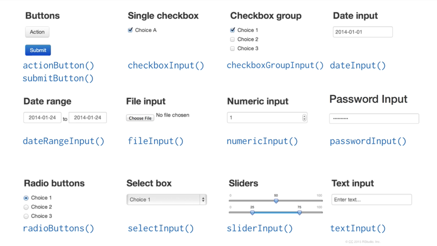
All input functions require 2 arguments: inputId and label. inputId is an ID that R will use when it creates the input element in a webpage, so that it can be referenced later. label is text that the user will see, describing what the input element is meant to be used for. The rest of the arguments are function-specific and can be explored at the full tutorial we linked earlier.
7.4.2 Output functions
Output functions allow you to add outputs of R code into your web page. These outputs can be images, plots, tables, text, or any other result of an R command. There are specific output functions for each type of output.
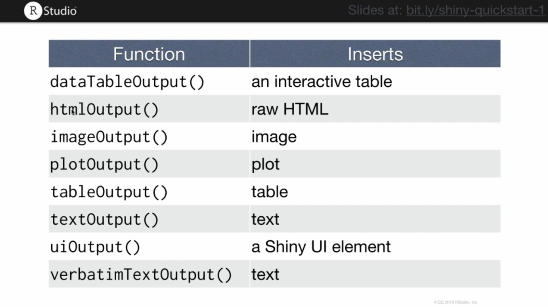
Rshiny output functions
Output functions have a similar set of syntactic rules to the input functions:
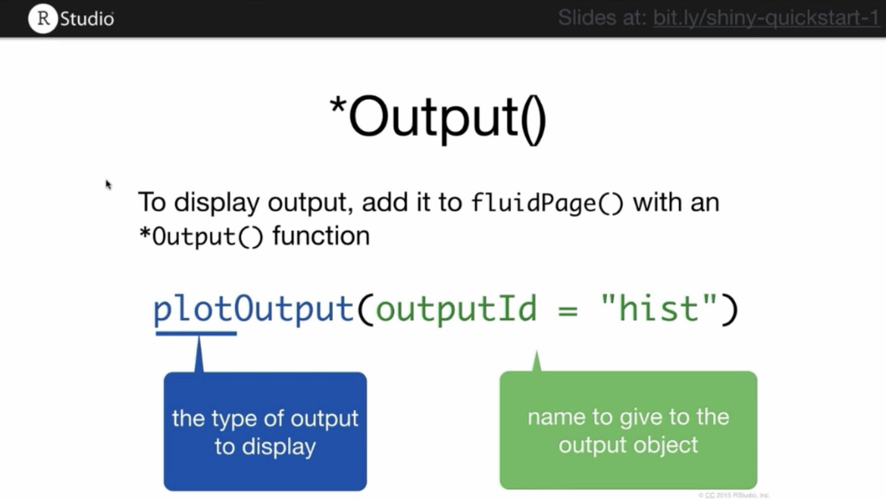
Here is the code for our app, now including an output function. Running this script won’t display any plot. It just reserves a space in the webpage for a plot with the assigned id hist. To actually create the plot, you must use the server function.
7.4.3 Server function
Server functions facilitate the interactivity in your web application. This is where you set up how an output (ex: graph) changes with the user input (ex: some number). However, there are 3 rules that have to be followed, which we have printed in this script:
function(input, output){
  #1 outputId is the outputId you defined with output function
  #2 To render a plot on a webpage, use renderPlot()
  output$outputId <- renderSomething({
    #3 inputId is the inputId you defined with input function
    someFunction(input$inputId)
  })
}
# Anything inside the curly braces is an R code. And it can be multiple lines of code.
You must define your output variable using outputId prefixed with output$ then call the R script that will produce the output with a render*({}) function. After this is done, you must call the user input with its inputId and prefix it with input$.
In our example script, we render a plot as follows:
# Save the ui as 'ui'
ui <- fluidPage(
  # Generate the slider input, give it a label and range
  sliderInput(inputId='num',
              label='Choose a number',
              value=25, min=1, max=100),
  # Plot the output as a histogram
  plotOutput('hist')
)

# Define the function of our server
server <- function(input, output){
    # Create the call for renderPlot()
    output$hist <- renderPlot({
      # Give a title and histogram command, with input from the slider
      title <- paste(input$num, 'random normal values')
      hist(rnorm(input$num), main=title, xlab='values')
  })
}

# Produce the Rshiny app
shinyApp(ui=ui, server=server)
To make more advanced applications, we highly encourage you to read the instructions on the Rshiny website.
7.5 More data visualization resources
More data visualization resources can be found in this spreadsheet.